CSS Grid in Next.js: Complete Guide with Responsive Layouts & Examples


CSS Grid in Next.js
CSS Grid is one of the most powerful layout systems in modern web development. It lets you build two-dimensional layouts — controlling both rows and columns — with very little code. When combined with Next.js, you can create responsive, production-ready page layouts fast.
In this guide, we'll cover:
- CSS Grid basics — the properties you'll actually use
- Responsive card grid — auto-fill, auto-fit, minmax
- Dashboard layout — named grid areas (sidebar + header + content)
- Mobile-first design — breakpoints done right
- CSS Grid vs Flexbox — when to use which
Let's build.
1. CSS Grid Basics
Before jumping to Next.js, here's a quick refresher on the core CSS Grid properties:
.grid-container {
  display: grid;

  /* Define columns: 3 equal columns */
  grid-template-columns: repeat(3, 1fr);

  /* Define rows: auto height */
  grid-template-rows: auto;

  /* Gap between cells */
  gap: 16px;
}
Key properties to know:
grid-template-columns— defines how many columns and their widthsgrid-template-rows— defines row heightsgap(orcolumn-gap/row-gap) — spacing between cellsgrid-column: span 2— makes an item span 2 columnsgrid-area— assigns an item to a named area
2. Responsive Card Grid in Next.js
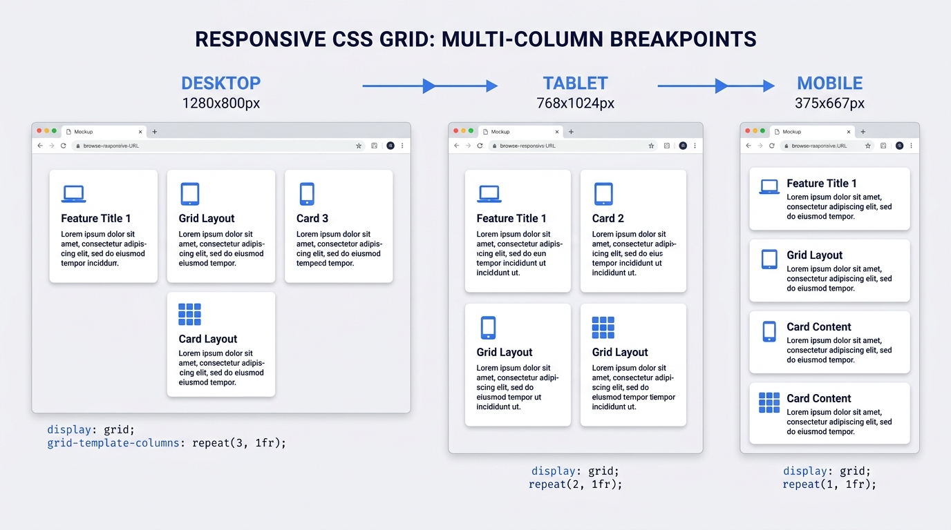
The most common use case for CSS Grid in Next.js is a responsive card grid — a layout that shows 3 cards per row on desktop, 2 on tablet, and 1 on mobile.
The component
Create components/CardGrid.jsx:
// components/CardGrid.jsx

const cards = [
  { id: 1, title: 'Getting Started', description: 'Learn the basics of Next.js and CSS Grid.' },
  { id: 2, title: 'Routing', description: 'How the App Router and file-based routing works.' },
  { id: 3, title: 'Data Fetching', description: 'Server components, fetch, and caching strategies.' },
  { id: 4, title: 'Styling', description: 'CSS Modules, Tailwind, and global styles in Next.js.' },
  { id: 5, title: 'Deployment', description: 'Deploy your Next.js app to Vercel in minutes.' },
  { id: 6, title: 'Optimizations', description: 'Images, fonts, and performance best practices.' },
];

export default function CardGrid() {
  return (
    <div className="card-grid">
      {cards.map((card) => (
        <div key={card.id} className="card">
          <h3>{card.title}</h3>
          <p>{card.description}</p>
        </div>
      ))}
    </div>
  );
}
The CSS
/* styles/CardGrid.module.css */

.card-grid {
  display: grid;
  grid-template-columns: repeat(3, 1fr);
  gap: 24px;
  padding: 24px;
}

.card {
  background: #ffffff;
  border: 1px solid #e5e7eb;
  border-radius: 12px;
  padding: 24px;
  box-shadow: 0 1px 3px rgba(0, 0, 0, 0.08);
  transition: box-shadow 0.2s ease;
}

.card:hover {
  box-shadow: 0 4px 12px rgba(0, 0, 0, 0.12);
}

.card h3 {
  margin: 0 0 8px;
  font-size: 1.1rem;
  font-weight: 600;
  color: #111827;
}

.card p {
  margin: 0;
  font-size: 0.9rem;
  color: #6b7280;
  line-height: 1.5;
}

/* Tablet: 2 columns */
@media (max-width: 1024px) {
  .card-grid {
    grid-template-columns: repeat(2, 1fr);
  }
}

/* Mobile: 1 column */
@media (max-width: 640px) {
  .card-grid {
    grid-template-columns: 1fr;
    padding: 16px;
  }
}
Result
The same grid adapts automatically across screen sizes:
Auto-fill vs Auto-fit (the smarter way)
Instead of manually defining breakpoints, you can let the browser figure out the column count:
.card-grid {
  display: grid;

  /* Browser creates as many columns as fit, each min 280px wide */
  grid-template-columns: repeat(auto-fill, minmax(280px, 1fr));

  gap: 24px;
}
auto-fill— creates as many columns as possible, even if emptyauto-fit— collapses empty columns, stretching filled onesminmax(280px, 1fr)— each column is at least 280px, at most 1 fraction of space
This single line replaces all your media queries for a basic card grid.
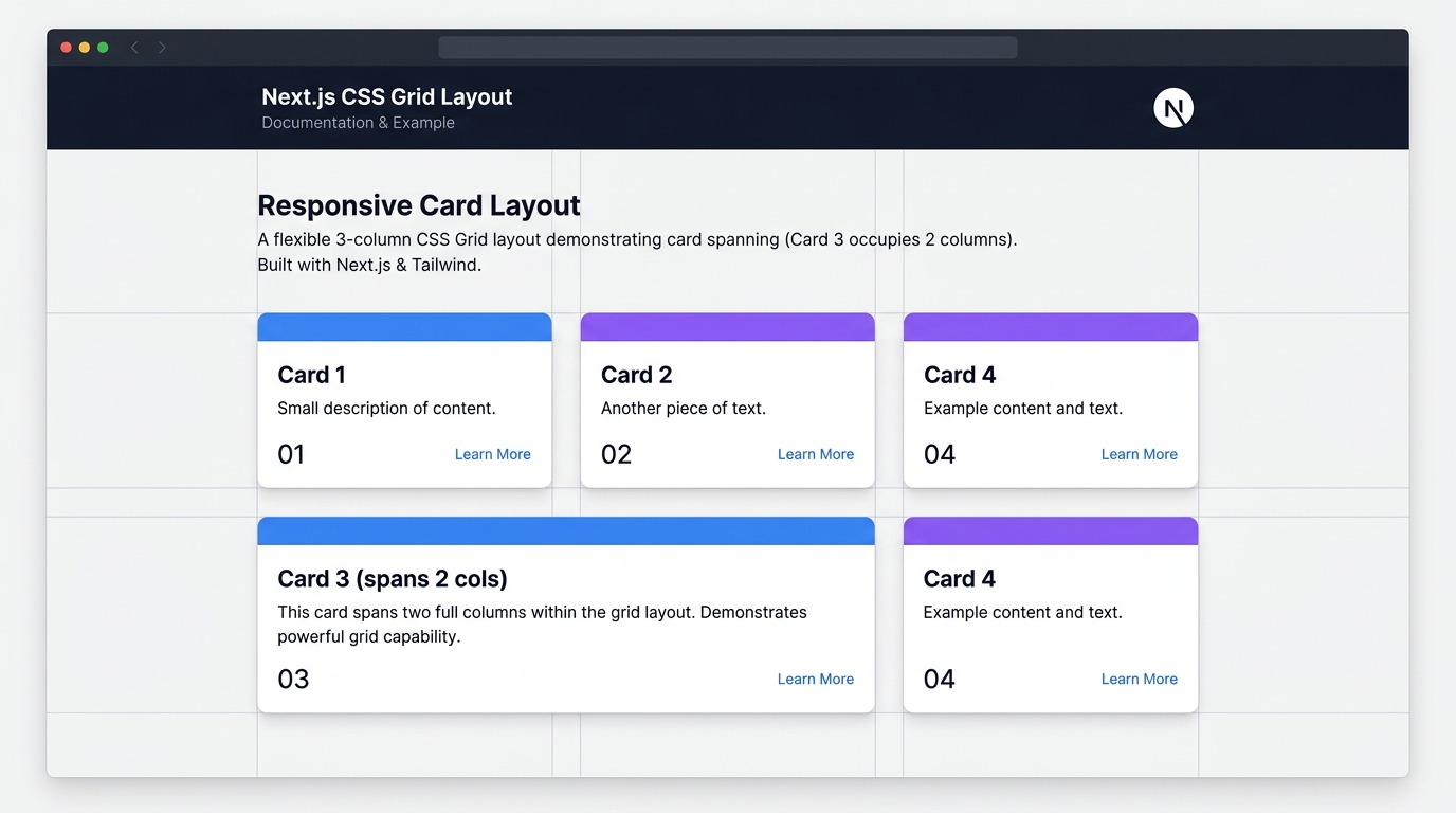
3. A Card with Column Span
Sometimes you want one card to be wider — like a featured item. Use grid-column: span 2:
export default function CardGridWithFeatured() {
  return (
    <div className="card-grid">
      {/* This card takes up 2 columns */}
      <div className="card card--featured">
        <h3>Featured: New in Next.js 15</h3>
        <p>Turbopack is now stable, React 19 support, and improved caching.</p>
      </div>

      <div className="card"><h3>Card 2</h3><p>Regular card.</p></div>
      <div className="card"><h3>Card 3</h3><p>Regular card.</p></div>
      <div className="card"><h3>Card 4</h3><p>Regular card.</p></div>
    </div>
  );
}
.card--featured {
  grid-column: span 2;
  background: linear-gradient(135deg, #6366f1, #8b5cf6);
  color: white;
  border: none;
}

.card--featured h3,
.card--featured p {
  color: white;
}

/* Don't span on mobile — it breaks the layout */
@media (max-width: 640px) {
  .card--featured {
    grid-column: span 1;
  }
}
4. Dashboard Layout with Named Grid Areas
For a more complex layout — like a dashboard with a sidebar, header, stats, and content — CSS Grid's grid-template-areas is the cleanest approach.
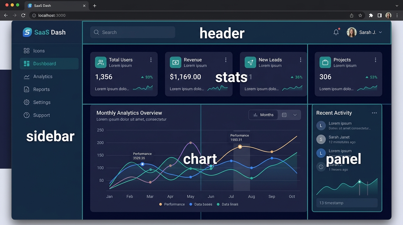
The layout
// app/dashboard/page.jsx

import Sidebar from '@/components/Sidebar';
import Header from '@/components/Header';
import StatsRow from '@/components/StatsRow';
import Chart from '@/components/Chart';
import ActivityPanel from '@/components/ActivityPanel';

export default function DashboardPage() {
  return (
    <div className="dashboard">
      <aside className="dashboard__sidebar"><Sidebar /></aside>
      <header className="dashboard__header"><Header /></header>
      <section className="dashboard__stats"><StatsRow /></section>
      <main className="dashboard__chart"><Chart /></main>
      <aside className="dashboard__panel"><ActivityPanel /></aside>
    </div>
  );
}
The CSS
.dashboard {
  display: grid;
  height: 100vh;
  grid-template-columns: 260px 1fr 320px;
  grid-template-rows: 64px auto 1fr;
  grid-template-areas:
    "sidebar header  header"
    "sidebar stats   stats"
    "sidebar chart   panel";
  gap: 16px;
  background: #f1f5f9;
  padding: 16px;
}

.dashboard__sidebar { grid-area: sidebar; }
.dashboard__header  { grid-area: header; }
.dashboard__stats   { grid-area: stats; }
.dashboard__chart   { grid-area: chart; }
.dashboard__panel   { grid-area: panel; }

/* Collapse to single column on tablet */
@media (max-width: 1024px) {
  .dashboard {
    grid-template-columns: 1fr;
    grid-template-rows: auto;
    grid-template-areas:
      "header"
      "stats"
      "chart"
      "panel";
    height: auto;
  }

  .dashboard__sidebar {
    display: none; /* or use a hamburger menu */
  }
}
The magic here is grid-template-areas — it reads exactly like the visual layout. Each string is a row, each word is a column area.
5. CSS Grid in Next.js with Tailwind
If your Next.js project uses Tailwind CSS, you get utility classes that map directly to CSS Grid:
export default function TailwindCardGrid({ items }) {
  return (
    <div className="grid grid-cols-1 sm:grid-cols-2 lg:grid-cols-3 gap-6 p-6">
      {items.map((item) => (
        <div
          key={item.id}
          className="bg-white rounded-xl border border-gray-200 p-6 shadow-sm hover:shadow-md transition-shadow"
        >
          <h3 className="text-lg font-semibold text-gray-900 mb-2">{item.title}</h3>
          <p className="text-sm text-gray-500">{item.description}</p>
        </div>
      ))}
    </div>
  );
}
Key Tailwind grid classes:
| Class | CSS equivalent |
|---|---|
grid |
display: grid |
grid-cols-3 |
grid-template-columns: repeat(3, 1fr) |
sm:grid-cols-2 |
2 columns on small screens |
lg:grid-cols-4 |
4 columns on large screens |
gap-6 |
gap: 1.5rem |
col-span-2 |
grid-column: span 2 |
6. CSS Grid vs Flexbox — When to Use Which
A common question when building layouts in Next.js is whether to use CSS Grid or Flexbox. Here's a simple rule:
| Scenario | Use |
|---|---|
| Two-dimensional layout (rows AND columns) | CSS Grid |
| One-dimensional layout (row OR column) | Flexbox |
| Card grid, dashboard, page layout | CSS Grid |
| Navigation bar, button group, icon + text | Flexbox |
| Unknown number of items that should wrap | CSS Grid with auto-fill |
| Items that should push to the edges | Flexbox with justify-content: space-between |
In practice, you'll use both — Flexbox inside cards, CSS Grid for the card container.
Conclusion
CSS Grid is one of the most underused tools in Next.js development. Here's what we covered:
- Responsive card grid with
repeat(auto-fill, minmax())— one line replaces all breakpoints - Column spanning with
grid-column: span 2for featured items - Dashboard layouts with
grid-template-areasfor readable, visual CSS - Tailwind integration with grid utility classes
- Grid vs Flexbox — choosing the right tool for each job
CSS Grid works out of the box in Next.js — no library needed. Start with the card grid pattern, and once you're comfortable, move on to named grid areas for complex page layouts.
Happy coding! 🚀